Style Guide
Stream Deck Style Guide
To keep the general Stream Deck UI consistent and simplify creation process for developers, we created this short style guide.
These general guidelines apply to all StreamDeck UI assets.
Overview

Default Stream Deck UI icons inside the sidebar are always single color. Key-images can be any color you like. Please note that a user can have quite some icons on his/her Stream Deck profile, so it's a good idea to take a moment and think about your visual (color) language.
The required image-format is PNG.
Stream Deck handles loading of higher-resolution assets (e.g. on retina or hi-dpi screens automatically: in this case, the image with an @2x suffix is loaded, e.g. actionimage@2x.png)
Here are some notes about icon sizes and color definitions...
Asset sizes and colors
| Icon | Size | @2x |
|---|---|---|
Action Image |
20x20 px | 40x40 px |
Category Icon |
28x28 px | 56x56 px |
Key Icon |
72x72 px | 144x144 px |
Action Image should be single color #d8d8d8 rgb(216,216,216)
Except that, there are no special color requirements. But please keep in mind, a user might have various keys installed on his/her Stream Deck, so it's a good idea to think about your color and style language.
If the action consists of 2 states, however, you can also provide separate icons for the states. You will find more info on states in the documentation for the Manifest.json
The images get dimmed automatically on mousedown or inactive states. So you don't need to provide imagery for these cases.
Please keep action-images single color! (#d8d8d8)
Default Stream Deck color definitions
Icons in Stream Deck's right sidebar should be single color (#d8d8d8). This ensures an overall nice user-experience.
For other Stream Deck keys, you can use any color you like.
Just for information purposes, here are the color definitions for the default Stream Deck keys:
 Action Image
#d8d8d8 rgb(216,216,216)
 Category Icon
 #c8c8c8 rgb(200,200,200)
 Key Image
 #d8d8d8``rgb(216,216,216)
 Key Image down/pressed
 #969696 rgb(150,150,150)
 Background
 #1d1e1f rgb(29,30,31)
Please keep action-images single color! (#d8d8d8) rgb(216,216,216)
Actions
Whenever possible, try to use toggling actions (e.g. on/off, up/down, etc..). Please keep in mind your user (most likely) use your action to get one thing done with a single press of a key.
So instead using an action to switch a light on and another one to switch it off, we encourage you to create ONE action to 'toggle' a light's state 'on' or 'off'.
Toggle action
Stream Deck allows you to define two states for every key (e.g. on and off). The idea behind this is, you can show different icons depending on the 'state' of the key, like so:
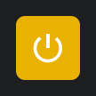
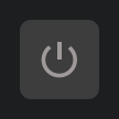
Stream Deck informs you in it's events which state is currently active. The immediate benefit of this is: a user saves one key on it's Stream Deck, because a toggling action basically combines tow actions into one.
You can find out more about states in this documentation about events sent
Stream Deck makes it easy to use different artwork for those states. The only thing you need to do is to add the appropriate image definitions in Stream Deck's manifest.
Property Inspector
Users like lean and clean UI, that's why you should take a bit time to plan and style your Property Inspector's items.
The easiest way to start with this, is to look at the provided samples and their sdpi.css file, where proper styling and alignment for lots of UI-elements is already included. You will find a detailed description of the included components in this documentation in the section about Property Inspector
The PISamples plugin, which you can download from the plugin store from within StreamDeck, also contains a whole bunch of prepared elements, which are ready to get re-used. You can use those PISamples as a source to quickly copy and paste UI-elements to your own plugin's Property Inspector. PISamples Plugin
The Stream Deck Template, which you can download from our GitHub Stream Deck Plugin Template is a good starting point, if you want to get started really quickly.